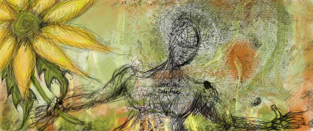
 I am continuing to work with Procreate. I added some more brushes and assets from Grutbrushes and Designcuts, but this piece is done with the Procreate native brushes. I was doing this to test out many of the brushes and it turned into a piece inspired by my feelings for Ukraine.
0 Comments
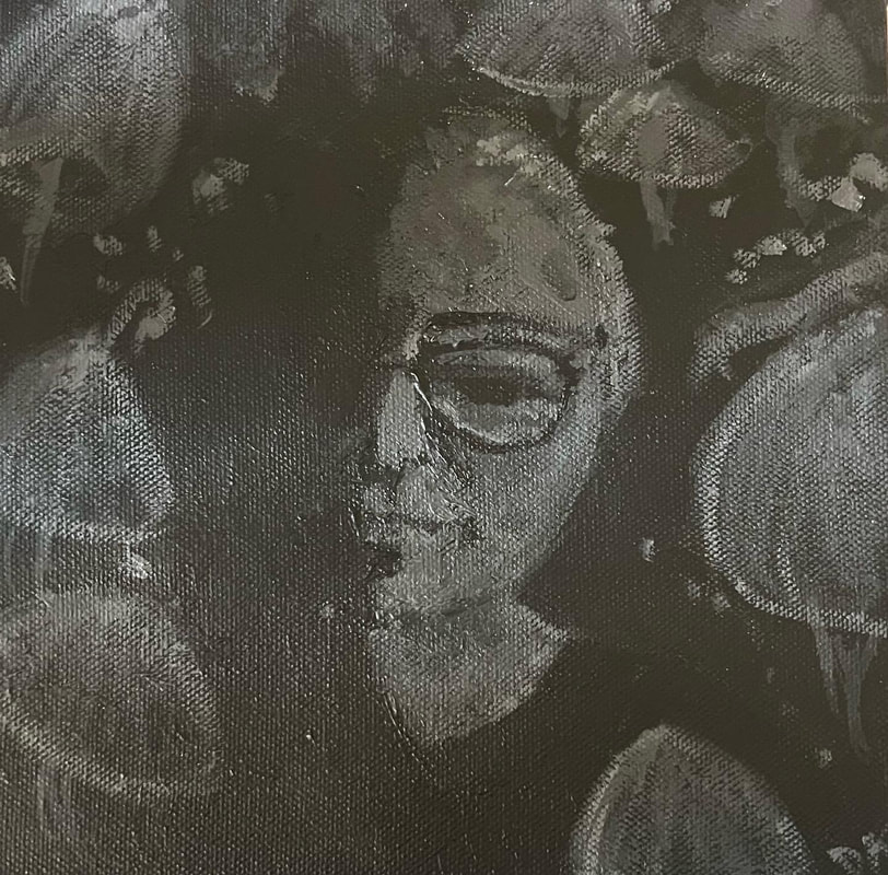
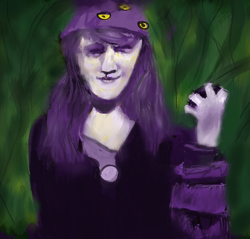 This was freehand drawn on my new iPad Air (5th generation) using the app, Procreate. This is just the beginning of my experimentation with this image and digital tools. It was great to pull up the reference photo of my adoptive grandmother. I am also playing with the tracing function to figure out how to trace a photo and then play with effects and brushes to create a piece of art that departs from the original reference. I am hoping that playing around with digital tools after taking college art classes would be interesting. I do not think I would have rendered this portrait like this without taking those classes.
I also assigned myself to assign colors to a sepia reference, which I often do to challenge myself. My goal is to be able to play around with painting ideas on the iPad when I am at a cafe, on the couch, or en plein air to practice drawing and composition skills and experiment. Any of these art pieces can become thumbnails for future paintings. I still love painting and doing mixed media like ink, pastels, charcoal, graphite, acrylic, photography, I love experimenting with ideas for paintings and often I do this while I am doing the painting, but what if I just did that work on the iPad? Then my reference is my own painting instead of a photo. The next step would to track down our projector. Then I can do larger scale paintings already knowing most of my choices in terms of color and composition. Someday, I will formulate a work flow that mixes fine art with digital including video and animation. Ultimately, I want to be a mixed media artist. Next semester, I will be taking a pottery wheel class and I want to use the app to draw designs and take notes. At some point, I want to create pottery and use digital art to create patterns. The iPad will let me take notes for classes and give me an opportunity to practice drawing and composition during my down time. So, my break will involve getting into the groove of digital art making, re-organizing my studio, and getting some artwork done. My other goal is to pour more attention to this blog. I have a lot of material from the past semesters to put up and I have lots of thoughts about everything. 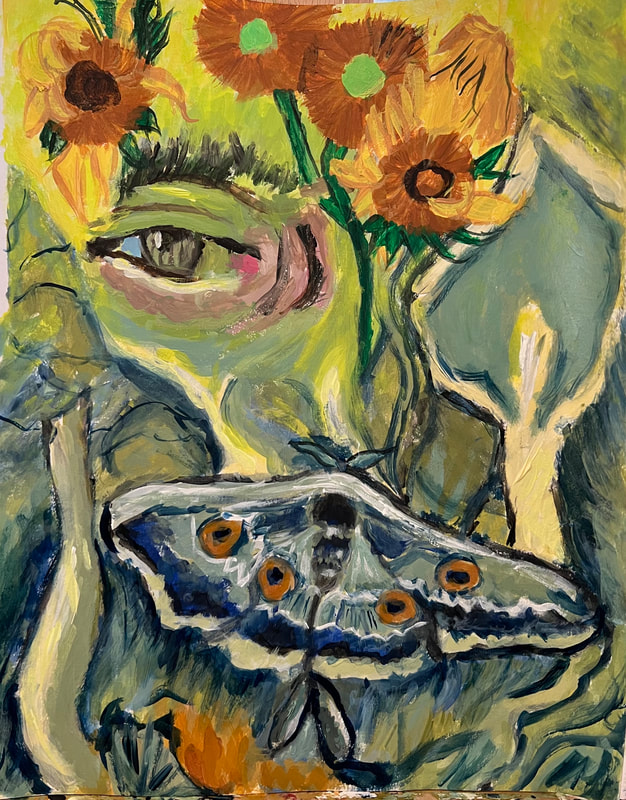 Last week I started the Spring semester at College of Marin. This semester I am taking two classes: Art 105: Contemporary Art History and Painting I. The first class is art history from 1980 to Present. Painting I is a multilevel class comprised of Painting I-IV.
Our first assignment was brushstroke practice painting by taking pieces of Van Gogh paintings and trying to replicate those areas of the paintings. I started out taking a portion of Van Gogh's The Gardener and focusing on the eye. Then I went to class and oddly forgot my painting artbin, So I had to beg and borrow paints and brushes. In class, I painted from Van Gogh's The Moth with the limited paint and paint colors. I returned home, looked up the paint colors Van Gogh used and got to work in creating a unified singular piece adding sunflowers and adding more Van Gogh specific colors. One of the Van Gogh colors is a color I have always loved -- Prussian Blue. I am happy I have a good amount of it because it is a beautiful color and it over-performed for this painting making everything better especially the greens. This was a fun assignment. . 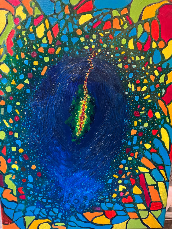 During winter break, we had some incredibly weird weather that included a cyclonic atmospheric river and this is my visualization of what an atmospheric river looks like. Atmospheric rivers are these long and narrow weather system that delivers a lot of moisture. That moisture is the key to all life after living through an extreme three-year drought and gut-wrenching years of mega wildfires. This is an 18x24 acrylic painting. I painted this in the midst of this crazy winter and who knows what the next winter might bring.
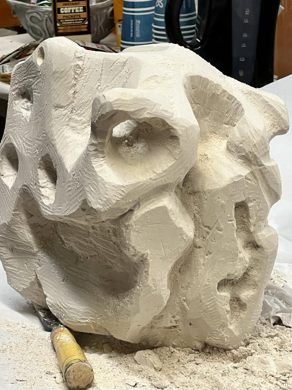
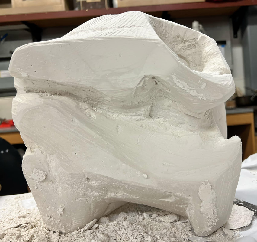
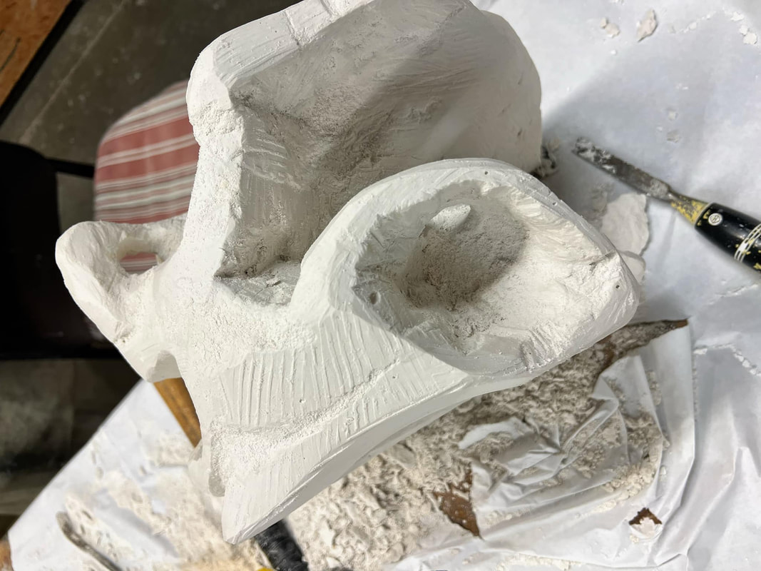
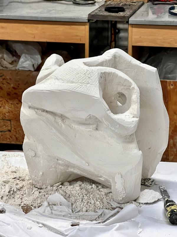
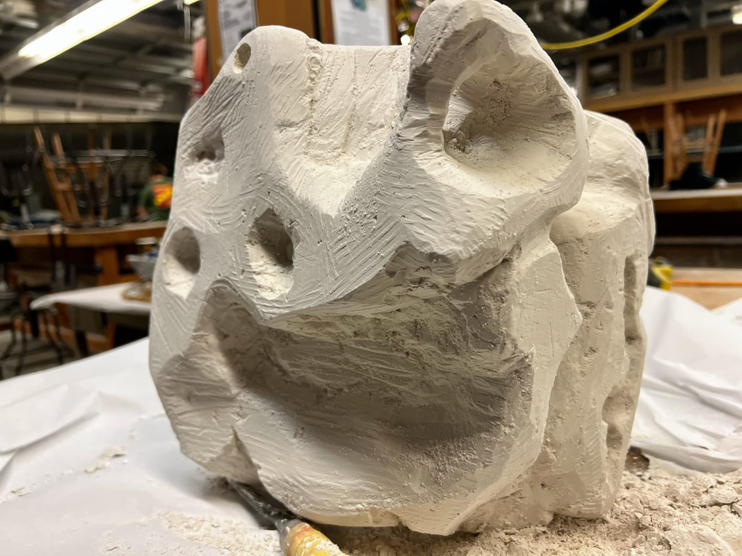
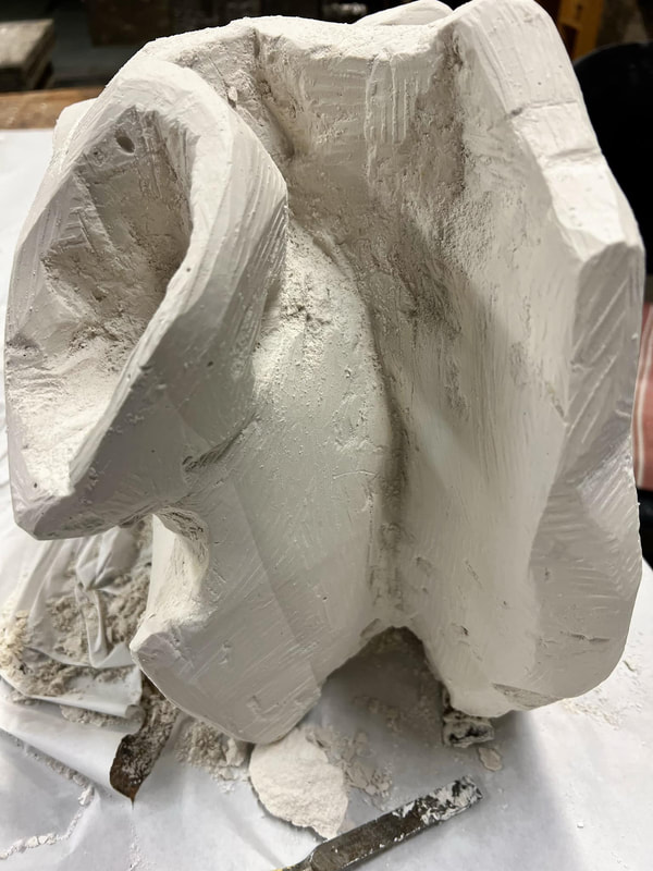
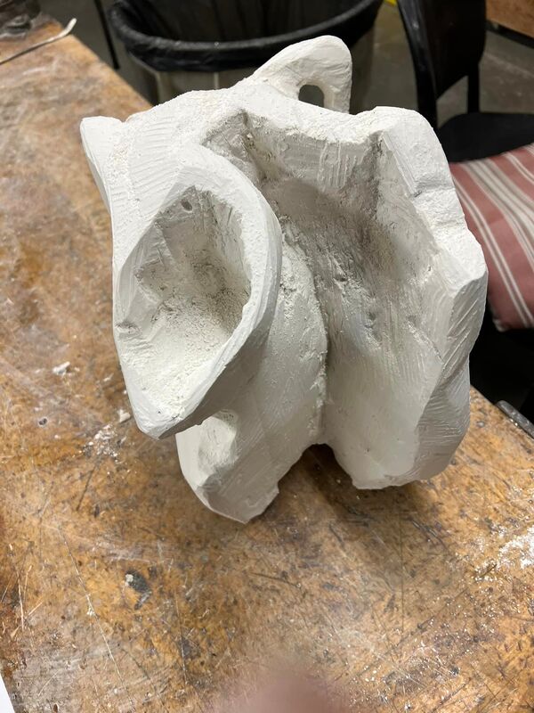
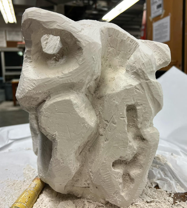
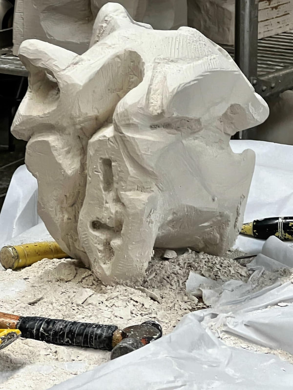
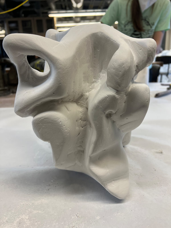
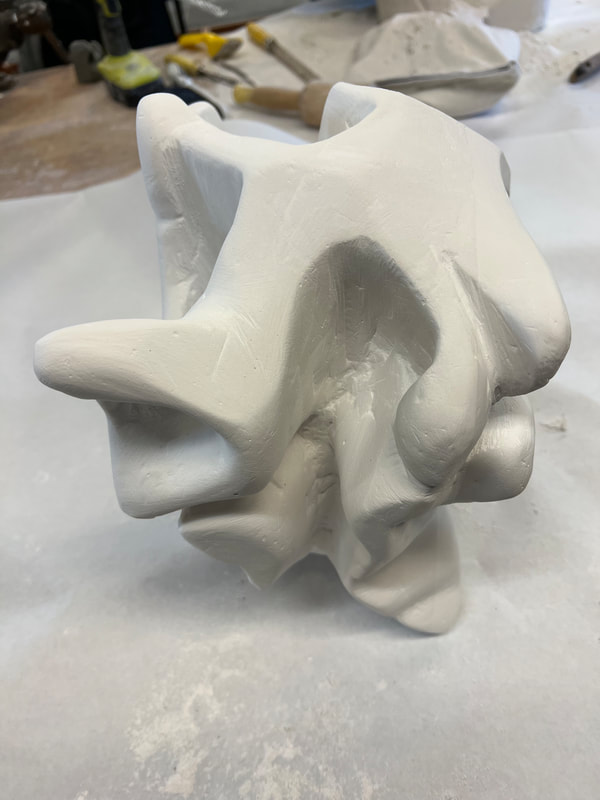
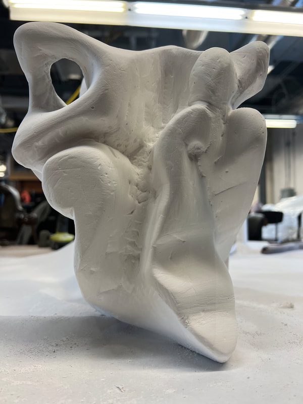
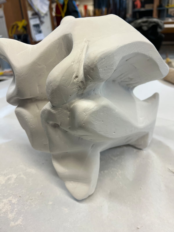
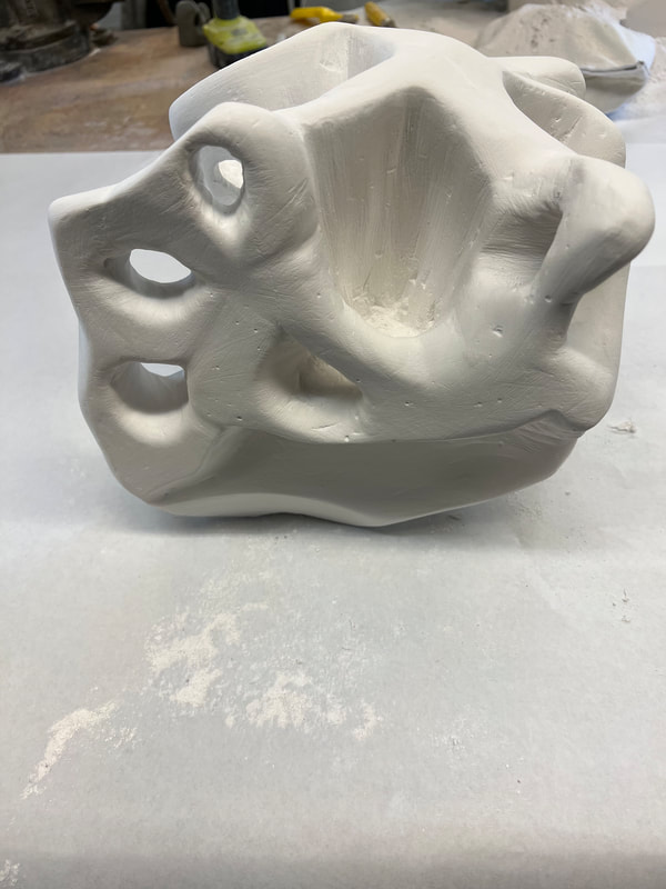
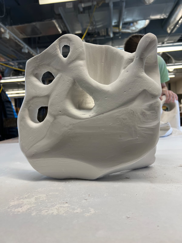
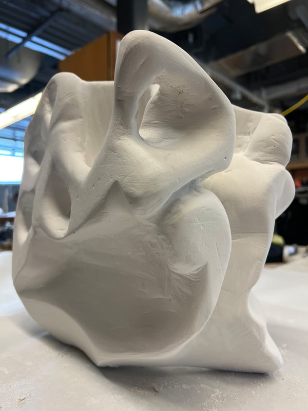
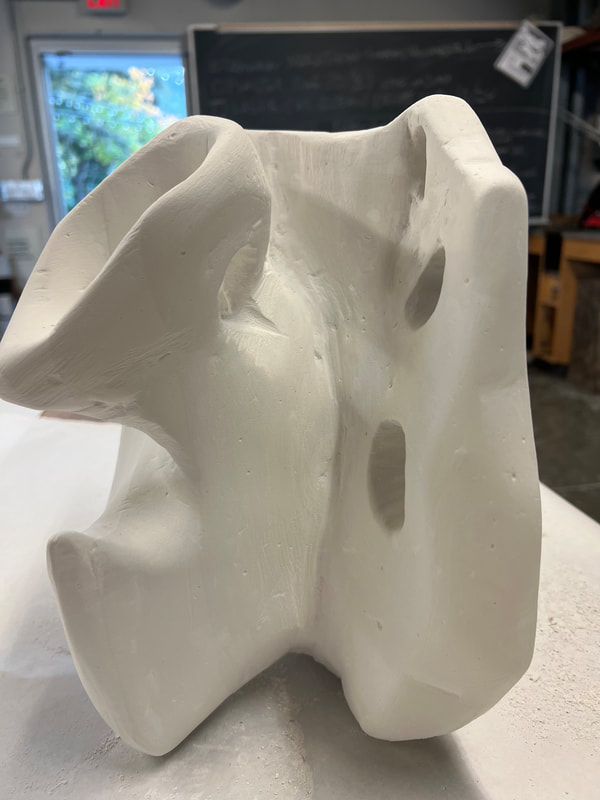
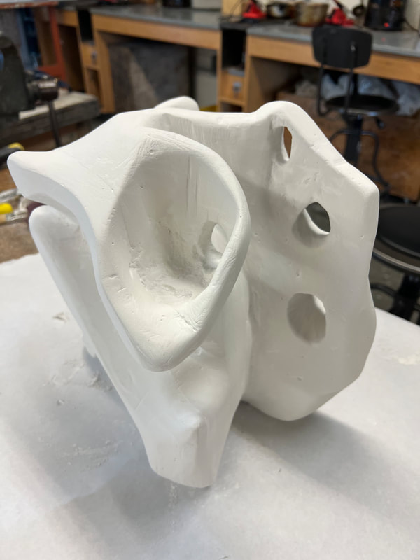
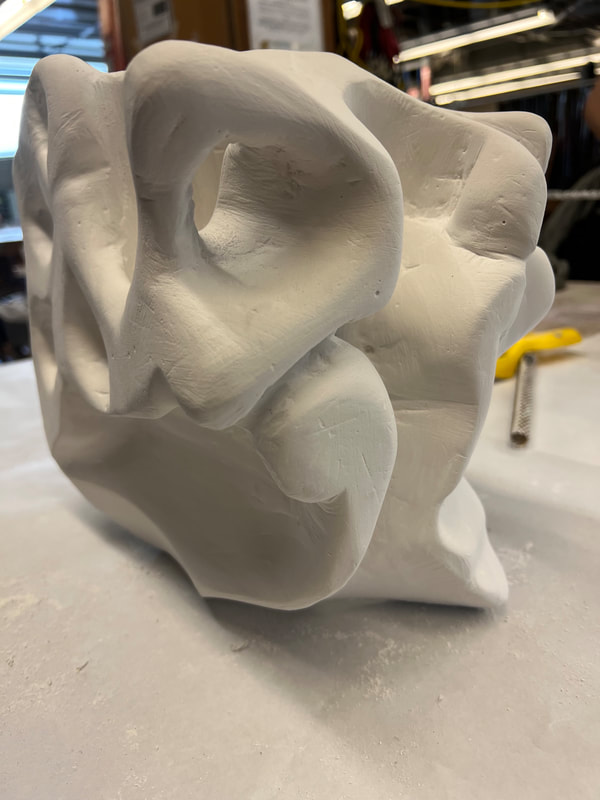
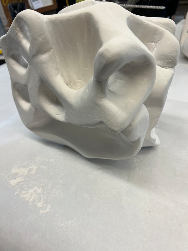
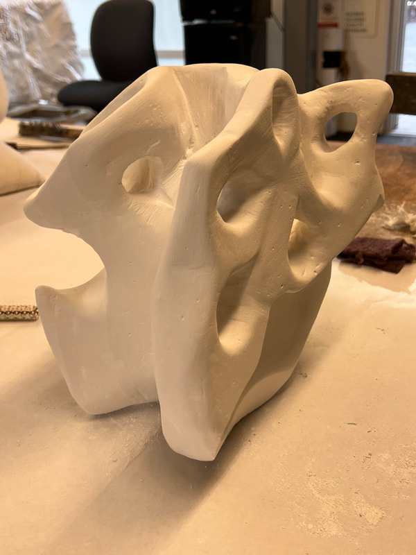
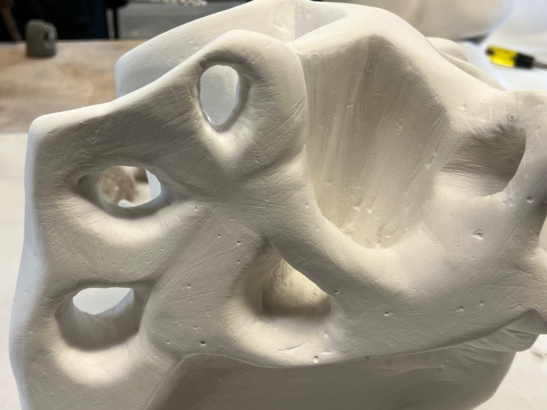
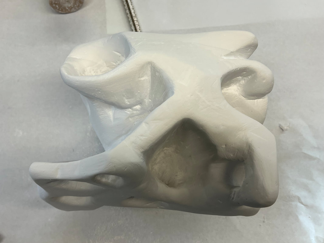
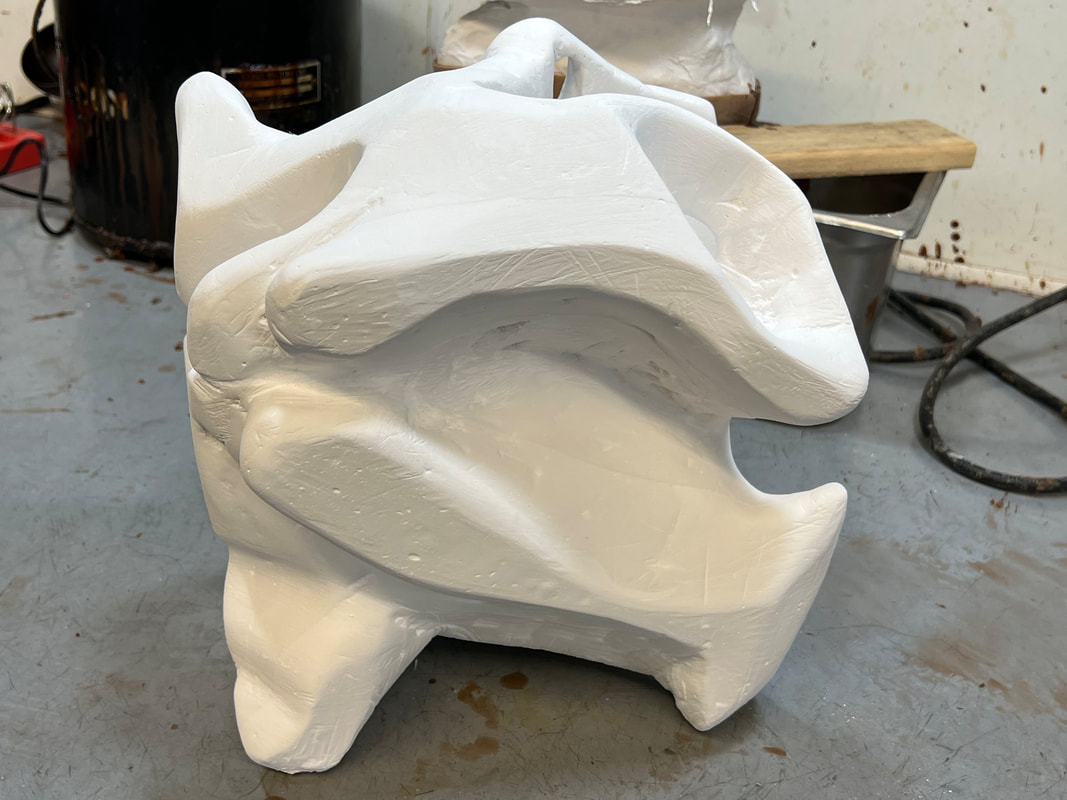
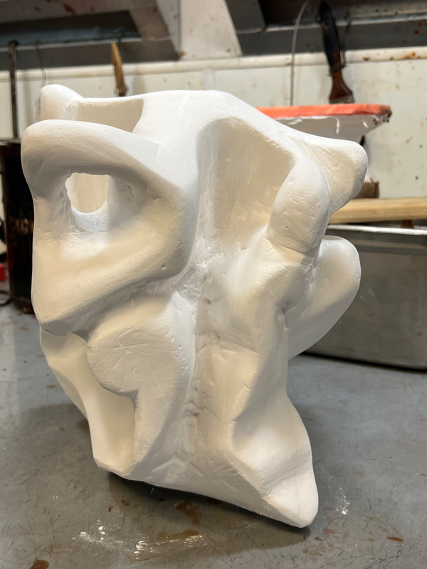
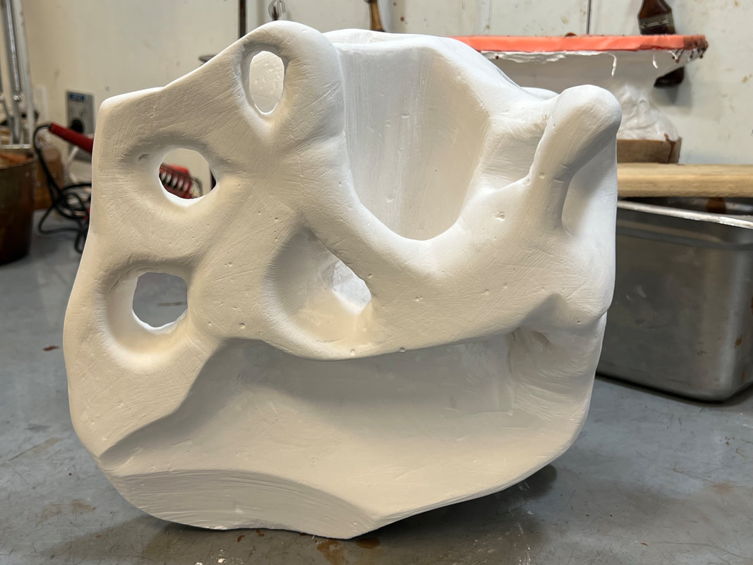
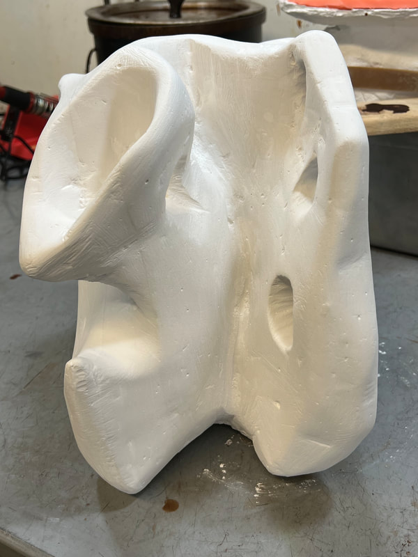
My 3D class has been a class that has stretched my brain. I haven't worked much in 3D in my artistic journey and so I went into this class pretty scared that I had no business being in this class. I will always have memories of working in a cloud of plaster and how satisfying it was to carve into plaster and see what it can do. Initially, I was fearful of the project, worrying if I was going to ruin the 10"x10" block of plaster, but then part of the block came apart. Something went wrong with the plaster footing, but it actually liberated me. Something had gone wrong and now I did not have to worry. I jumped in and just let myself play with the plaster. In fact, I dared myself to do crazy things and push the block of plaster as far as I could. This sculpture is in my studio as a reminder that I can do scary things. It is a reminder of when this 3D class started to not be so scary. 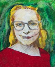 I love oil pastels since you can have these bold oil painting like art. This is a self-portrait where I can pump up the color.
After 7 years with my beloved iMac, it is starting to show it's age. In the past few months, I noticed the machine slowing down and a significant drop in productivity. After a lot of research, I went for the 14" Macbook Pro M1 with 10 core CPU, 16 core GPU, 32gb RAM, and 1 TB of SSD. It was a bummer that the model iMac I had wouldn't let me use it as a secondary monitor, so I went out looking for a secondary monitor. I went with the BenQ PD3220U 32 Inch 4K IPS AQCOLOR Computer Monitor.
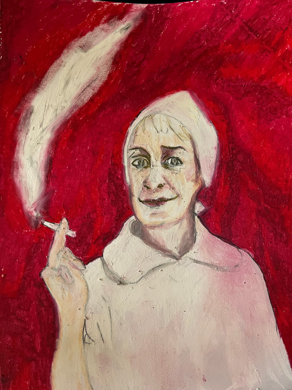
So far, it has been a true workhorse, My only complaint is the lack of USB ports and so I am going to have to rely on wireless devices. While I have yet to actually take it out on the road, it is a laptop and I could use it at a cafe when COVID is over. 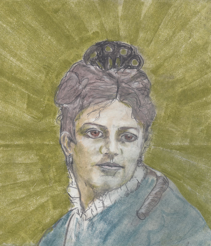 I am one of those fortunate people to have these great photos of my ancestors. It is more amazing considering I did not know who my birth family was until I was 27 years old because I was adopted. One of the more fascinating ancestors was Mary Jane Morgan Rulofson. She was the sister of my great, great grandmother, Salome Morgan Lincoln Fridley. In the 1860s-70s, Mary Jane came to work at the studios of the famous Bradley-Rulofson Photography in San Francisco. She ended up marrying her boss, William Herman Rulofson, who was a noted portrait photographer. So, there are some amazing photos of her and her husband's family. They went to Paris in 1878 to exhibit his work which included a life size portrait. Family lore talks about my great-great grandmother Salome having clothes and perfumes from Paris, presumably from her sister and brother-in-law. William Rulofson hung out with the likes of Ambrose Bierce and wrote a book/pamphlet against the scandal of the waltz called, "The Dance of Death". He ended up "falling off" the roof of his several story studio building in the 1870s and leaving his estate to her. There are testimonials at the time that Mary Jane was very able businesswoman and managed the studio until 1883. I used Derwent XL graphite and charcoal blocks with a graphite pencil. I think it turned out really well. Then I used the tool over at Myheritage to animate photos and got some interesting results. I have to say that this was probably the most realistic drawing I have made.
|
AuthorD.K. Castellucci is an artist living in Marin County who works in acrylic, oil paint, oil and soft pastels, charcoal, gouache, watercolors, graphite and Archives
January 2024
|
 RSS Feed